
If you’ve ever felt attracted to a brand before reading anything about it, color probably played a big role. Color acts as a quick visual and psychological signal.
With shorter attention spans and endless content, color is one of the quickest ways to show trust, emotion, and intent. Here’s how color works in modern branding and how marketers can use it more effectively.
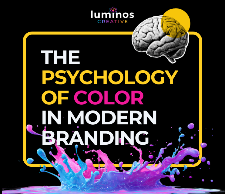
Color Is Processed Faster Than Content
Before users read headlines or evaluate offers, they feel something. That feeling often comes from color.
People process visual information much faster than text, and color plays a big role in first impressions. We often make snap judgments about products in seconds, and color is a key influence.
Color is more than decoration; it helps position your brand. It sets the mood before anyone reads your message.
Color Drives Emotional Associations
Different colors create different emotional and psychological reactions. While not everyone reacts the same way, the behavior patterns are strong enough to make a difference.
- Blue is trust, security, and professionalism
- Red is urgency, excitement, and action
- Green is health, growth, and balance
- Yellow is optimism and attention
- Black is luxury, power, sophistication
Color can shape mood and behavior without us realizing it. That’s why banks use blue, while fast-food brands choose red and yellow.
These choices are intentional, aiming to create a certain feeling. Choose colors based on the emotions you want people to experience, not just what looks nice together.
Color Impacts Brand Recognition and Memory
Using the same colors regularly can make your brand much easier to recognize. Some studies say color can boost brand recognition by up to 80%.
Think of brands you recognize right away just by their color, even without a logo. Marketers do this on purpose.
Color acts as a memory cue. Over time, it helps people feel familiar with your brand and makes their choices easier.
Your brand color is a design detail and a long-term asset. Changing it too often makes your brand less recognizable to both clients and prospects alike.
Context Matters More Than Color Alone
Many marketers overlook that colors don’t stand alone. What a color means can change depending on:
- Industry context
- Cultural differences
- Surrounding colors and contrast
- Audience expectations
For example, white often conveys simplicity and cleanliness in Western cultures, but in some cultures it symbolizes mourning.
Color strategy depends on context. What works for one group or industry might not work for another.
Contrast and Readability Influence Behavior
It’s not only about which color you pick, but also how you use it. High contrast makes things easier to read, understand, and access.
Research on how people use computers shows that contrast affects how easy something is to use and how well people can complete tasks. This aspect matters most for:
- CTAs
- Buttons
- Navigation
- Mobile interfaces
A good-looking color palette that’s hard to read won’t work well. How it functions is always more important than how it looks.
Color Influences Conversion, But Not in Isolation
You might have heard that “red buttons work better than green ones.” The truth is, it’s more complicated than that.
There isn’t a single “best” color for getting results. Test colors in your own system, since color works as part of the whole experience, not on its own.
Modern Branding is About Systems, Not Single Colors
The best brands today don’t just use one color—they create full color systems. These include:
- Primary brand color
- Secondary palette
- Accent colors
- Functional colors (success, warning, error)
- Gradients and motion-based color transitions
Using a layered color system helps brands stay consistent but also flexible across different platforms. A strong visual framework makes your brand easier to use and recognize. Go beyond just picking a logo color; build a system that works across digital, print, and video.
The Real Takeaway of Color Is Strategy, Not Style
In the end, color is one of the most overlooked tools in marketing. It shapes:
- First impressions
- Emotional response
- Brand recall
- User behavior
And color does all this before anyone even reads your message. The most successful brands use color to shape how people see them.
Quick Strategic Checklist for Marketers
Before locking in your brand colors, ask:
- What emotion do we want to evoke immediately?
- Does this align with our industry expectations—or intentionally challenge them?
- Will this palette scale across platforms and formats?
- Is it accessible and readable in real-world use?
- Does it reinforce long-term brand recognition?
If you can answer these questions with confidence, you’re picking colors and building a brand people will connect with. Want to talk about this topic or discuss other marketing topics or questions?
You can call Luminos Creative at 1-888-575-4891. We look forward to hearing from you soon.